Pay Kit Android: UI Components
Pay Kit Android: UI Components
Buttons
The Pay Kit SDK provides an unmanaged custom styled Button. Cash App provides Jetpack Compose components as well as View-based buttons. The buttons are an optional dependency, and must be included separately.
The Button provided by the SDK is unmanaged. It is a stylized button that isn’t aware of SDK events out-of-the-box. It is the developer’s responsibility to call the above method when the button is clicked and also manage any disabled and loading states.
You can change the size of the styled buttons within certain limits.
These limits are:
- at least
34dptall - at least
122dpwide - at most
54dptall
Styles
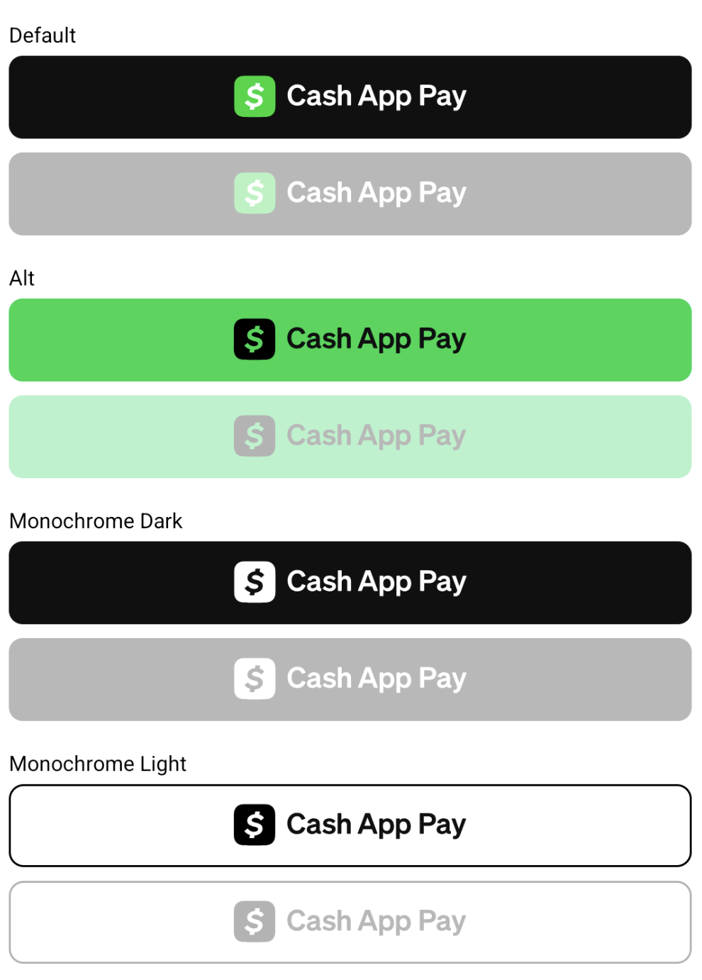
There are four basic static styles that do not change dynamically if your app switches between light and dark mode.
The examples below show the button styles and disabled variants.
Jetpack Compose
To add the Jetpack Compose version of the CAP button, use the following implementation:
Or via Gradle version catalogs (libs.toml):
To use the Cash App Pay themed button:
Available CashAppPayButtonStyle styles
Default: Polychrome (green) Cash App logo on dark backgroundAlt: Dark monochrome Cash App logo on green backgroundMonochromeDark: Light Cash App logo on dark backgroundMonochromeLight: Dark Cash App logo on light outlined backgroundMonochrome: Theme-aware monochrome style that automatically picksMonochromeDarkorMonochromeLightbased on the app’s current UI mode configuration.
View-based
To add the Views version of the CAP button, use the following:
Or via Gradle version catalogs (libs.toml):
To use the Cash App Pay light background button:
Available CashAppPayButtonStyle styles:
Default: Polychrome (green) Cash logo on dark backgroundAlt: Dark monochrome Cash logo on green backgroundMonochromeDark: Light Cash logo on dark backgroundMonochromeLight: Dark Cash logo on light outlined background
Use Android’s Resource Qualifiers, such as values-night, to provide a button variation that follows the system’s theme.